COMICALLY COMIC 2


MORE RESEARCH


Although I had already done much research I still kept going back and forth to this research whilst making work and also looking at new sources such the movie titles of the movie “Grease”, a favourite of mine. I chose to look at these because I think the illustratiojns are brilliant, I absolutely love the lettering and I think it’s a great way of presenting characters and I thought it was something I could in my novel. I also looked at a collaboration comic of Robert Crumb and Harvey Pekar, a couple of “Mome” comics which are comics anthology published by Fantagraphics Books and “Kafka” another comic book by R. Crumb.


Grease Movie Credits


Robert Crumb & Harvey Pekar


Mome


KAFKA By Robert Crumb


Here are some of the illustrations that stood out to me whilst doing some research and which I thought would help me in my own process, details I thought I could use or would show me how to successfully create an ambience, reflect a mood, set a scene. See the notes highlighted in yellow.


DRAW AWAY

ILLUSTRATING


Just a little gallery of most of the illustrations made for the graphic novel part of my FMP.


This slideshow requires JavaScript.


COMICALLY COMIC


ROBERT CRUMB


American illustrator and artist Robert Crumb is best known for his distinctive style and satirical tone and creating the cartoon character Fritz the Cat.

Controversial American cartoonist Robert Crumb is widely considered to be the “father of underground comics.” His work has a distinctive style and satirical tone and often features strongly stereotyped portrayals of minorities and overly sexualized women. He is best known for creating the cartoon characters Fritz the Cat, Mr. Natural and Devil Girl.

https://www.biography.com/people/robert-crumb-9262692

https://www.theguardian.com/books/2016/apr/24/robert-crumb-interview-art-and-beauty-exhibition

http://www.crumbproducts.com/


DANIEL CLOWES


Daniel Clowes is a celebrated graphic novelist (Ghost World, David Boring, Ice Haven, Patience), academy-award nominated screenwriter, and frequent cover artist for the New Yorker. His papers were recently acquired by the University of Chicago library.

https://www.toddhignite.com/daniel-clowes/

https://www.theguardian.com/books/daniel-clowes

http://www.danielclowes.com/

N & C// BEGINNINGS

CONCEPT


1STSTEPS &THOUGHTS:


Whilst reading the book I went picking out quotes that really spoke out to me, that I thought said a lot about the book, its story, in just a few short words. Quotes that would inspire me in creating a powerful visual. Out of all the quotes I picked out these are the ones that most stood to me as they were giving me an interesting perspective from which to work from and base my front cover on:

“Do you ever wonder what it would be like if our positions were reversed?” I ask. Jack’s puzzled look, I continue. “If we whites were in charge instead of crosses?” “Can’t say it’s never crossed my mind”, Jack shrugged. “I used to think about it a lot”, sigh. “Dreams of living in a world with no discrimination, no more prejudice, a fair police force, an equal justice system, equality of education, equality of life, a level playing field…”


I found this extremely interesting. The idea of “reverse racism”. Of course racism from black people towards white people exists but not in the huge dimensions that black people have experienced for centuries. Therefore, this reveresed situation was what I found most interesting about the book and what I was most motivated to work with. My ideas concerning this were really to show this reverse in reality, and to make the reader really think about how it would have been if famous related historical events had been lived, endured, by the other race… How it would feel and how it would be if it had been the other race who suffered this extreme hate.


 CHOSEN PHOTOS TO WORK FROM:


PLAYING AROUND/EDITING PHOTOS


//PENGUIN PROJECT//

NOUGHTS & CROSSES


I chose this particular book because of its previous covers. I found them very classic, non appealing, and just not vibrant enough for the story that was inside. That is what pushed me to chose this book, what got me motivated to come up with something more exciting, appealing and revealing of the power of its’ story. I wanted to break the classic book cover barriers and create something that would be eye catching to its’ young audience.


ABOUT THE AUTHOR


Malorie Blackman has written over sixty books and is acknowledged as one of today’s most imaginative and convincing writers for young readers. She has been awarded numerous prizes for her work, including the Red House Children’s Book Award and the Fantastic Fiction Award. Malorie has also been shortlisted for the Carnegie Medal. In 2005 she was honoured with the Eleanor Farjeon Award in recognition of her contribution to children’s books, and in 2008 she received an OBE for her services to children’s literature. She has been described by The Times as ‘a national treasure’. Malorie Blackman was the Children’s Laureate 2013-15.


ABOUT THE BOOK

Two young people are forced to make a stand in this thoughtprovoking look at racism and prejudice in an alternate society. Sephy is a Cross — a member of the dark-skinned ruling class. Callum is a Nought — a “colourless” member of the underclass who were once slaves to the Crosses. The two have been friends since early childhood, but that’s as far as it can go. In their world, Noughts and Crosses simply don’t mix. Against a background of prejudice and distrust, intensely highlighted by violent terrorist activity, a romance builds between Sephy and Callum — a romance that is to lead both of them into terrible danger. Can they possibly find a way to be together? First published in 2001 Noughts & Crosses deals with racism, terrorism, the class system and the artificial divides we always seem to put between ourselves and others. It is as relevant now as it was then.


EXISTING BOOK COVERS


  • Very classic – looks like every other book you would study in english class, but that you wouldn’t get particularly excited about
  • Very classic and unappealing, nothing new, modern or eye catching.
  • The best one so far: more modern, attractive; colour & type. Looks more for all public and not just for high school student.


TARANTINO IS MY TYPE


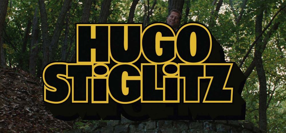
TYPOGRAPHY IN MOVIES


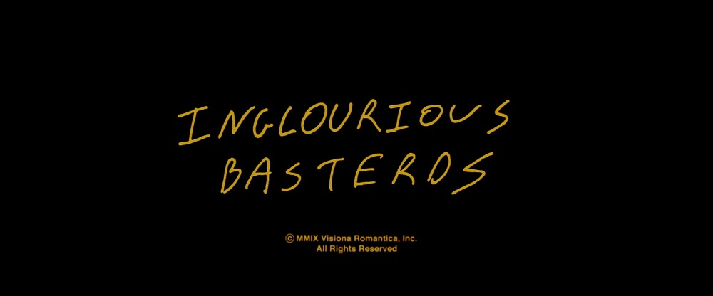
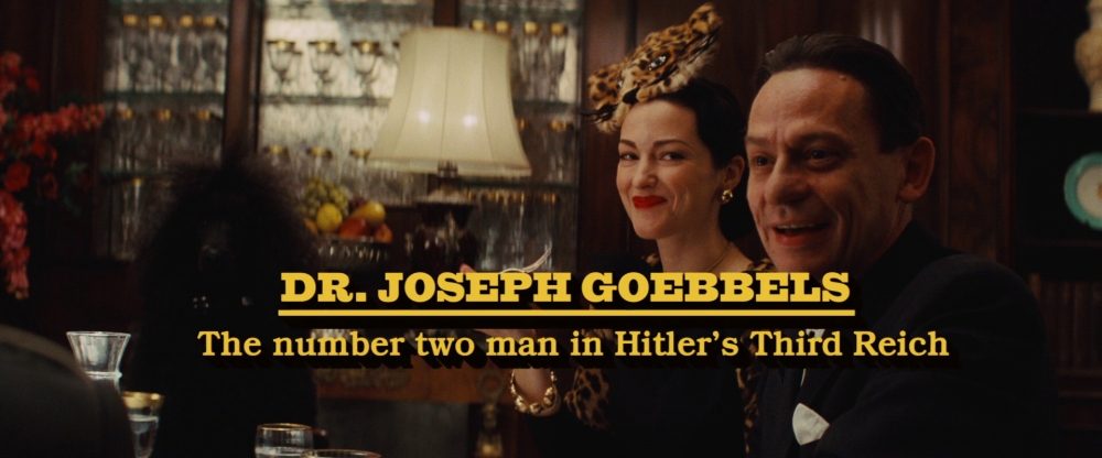
Typography in movies is one of those things that I just love and gives me thrills. So for these two projects it was key for me to look into that obviously but also to choose someone specific. And Tarantino is a genius when it comes to how he uses type in his movies. There isn’t really anyone else who does what he does. He gives a lot of power to typemin his movies and type brings a lot to his movies as well, gives them character and originality.

I chose him because of this, because I get excited when one of his movies starts and I see credits, names, chapters appear. So here are some of my favourite typography-related moments from some of his movies:


images.jpeg


inglourious-basterds-blu-ray-movie-title-large.jpg

Basterds-2-400.jpg

Joseph_Goebbels_title_card.jpg

94df482d26b6073f632bb79593de9497.jpg

MAKE THE REMAKE

MORE ARTIST RESEARCH FOR POSTER PROJECT.

Since I was remaking classic movie posters with my own spin it was key for me to look at the many remakes that already exist made by plenty of graphic designers and illustrators out there that put their own spin on it. And the best place to find these was Pinterest.

Take a look :


FAVOURITE


MEDIOCRE


NOT SO GREAT


https://www.digitalartsonline.co.uk/features/illustration/how-illustrated-movie-posters-are-making-come-back/

https://www.vice.com/en_uk/article/bnaaew/can-we-have-movie-posters-like-this-again-please-

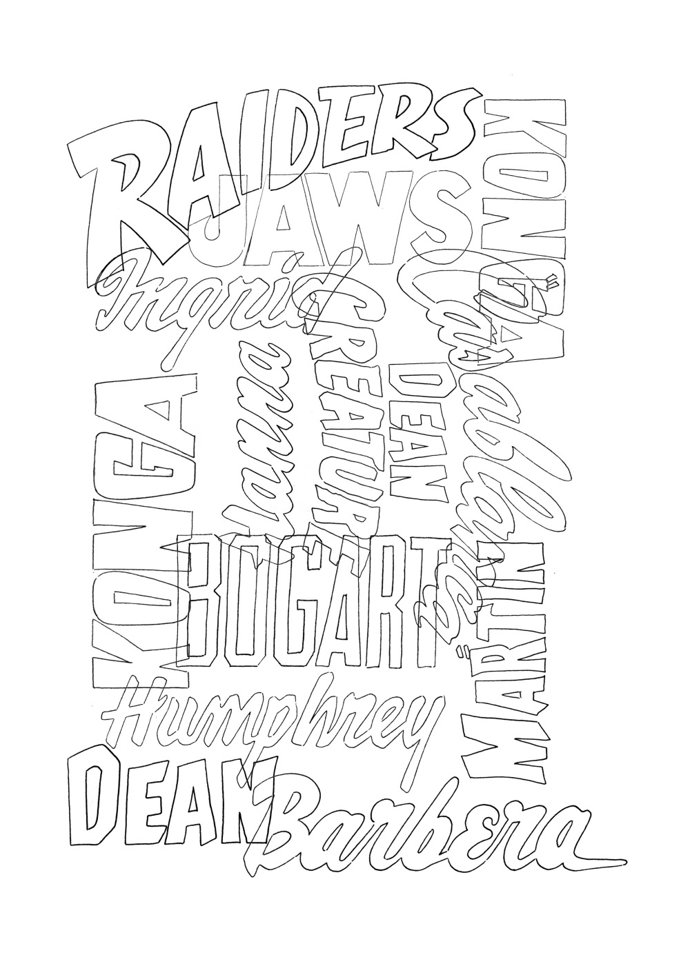
NEW STYLE NEW TYPE

1.

BEGINNINGS

LCOMPO.jpg

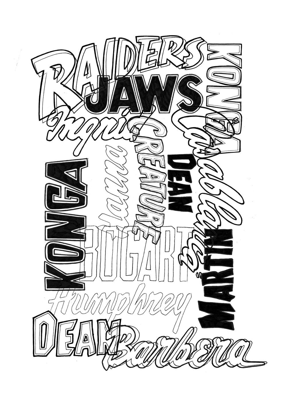
2.

ADDING LAYERS

thumbnail_LETTERING2.jpg

3.

FINISHED


LETTERING POSI.jpg


This design was done and I was ready to print. I was satisfied with the result and thought it looked like a strong visual piece and I was happy it made only of hand lettering. I should work more with just that.

POST POSTERS

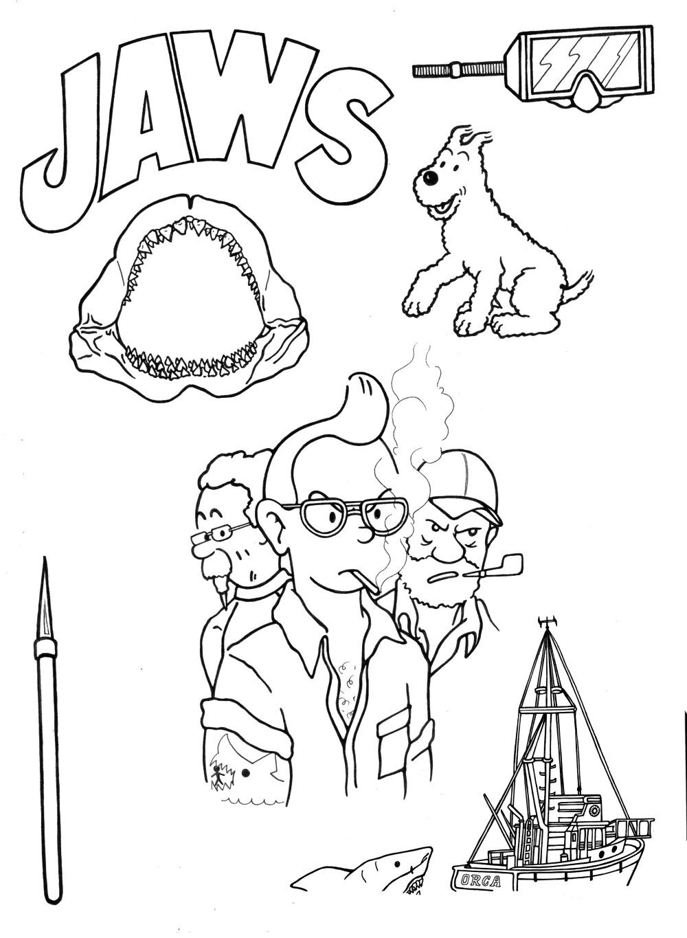
BEGINNINGS


Illustrating the elements


tintin parts.jpg


COMPOSING

Putting the elements together. The poster begins to take form.


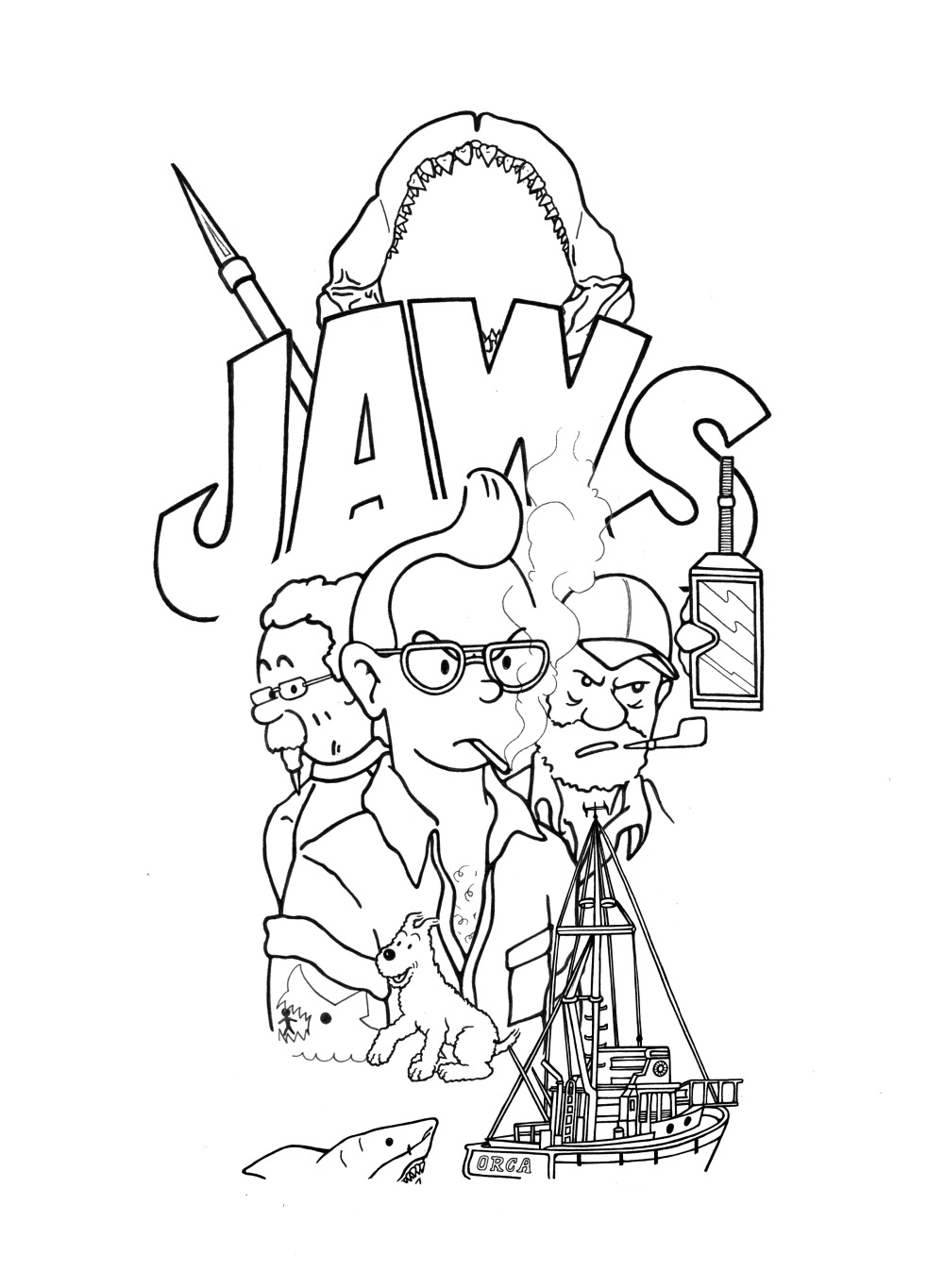
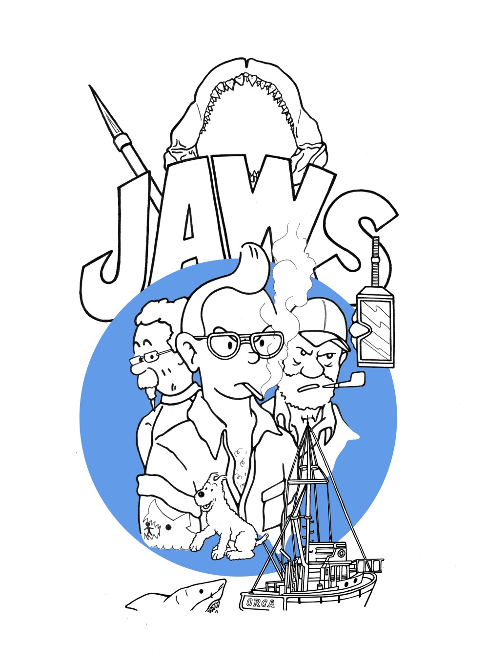
JAWS = TINTIN

TINTIN2.jpgTINTIN1.jpg


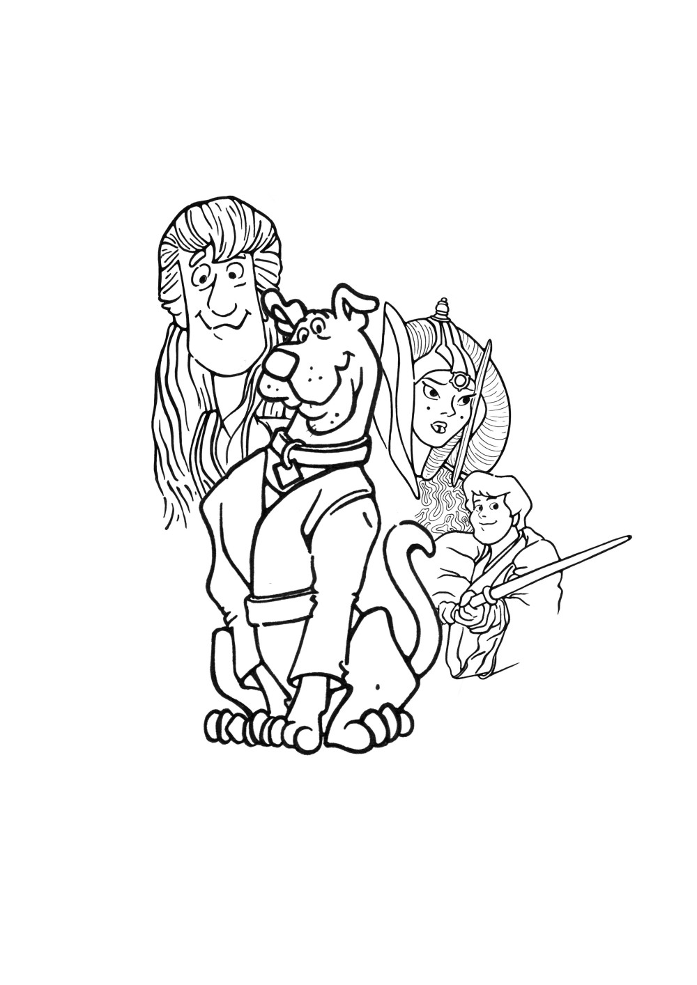
STAR WARS EPISODE I = SCOOBY DOO

SCOOBYDOO1.jpg


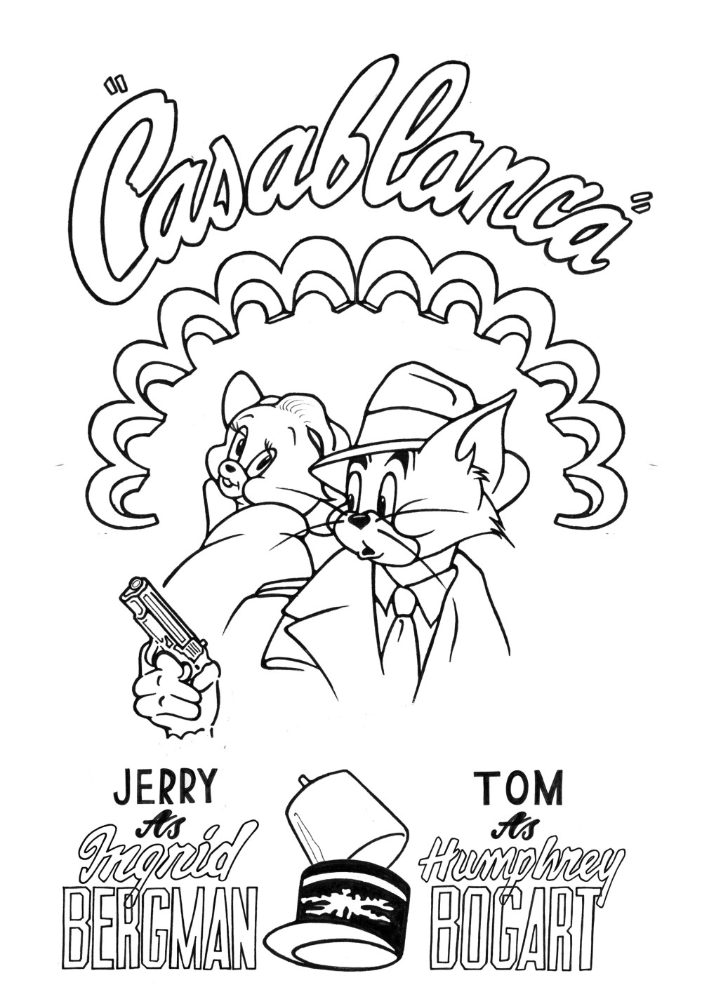
CASABLANCA: TOM & JERRY


TOM+JERRY ELEMENTS.jpg


TOM+JERRY1.jpg