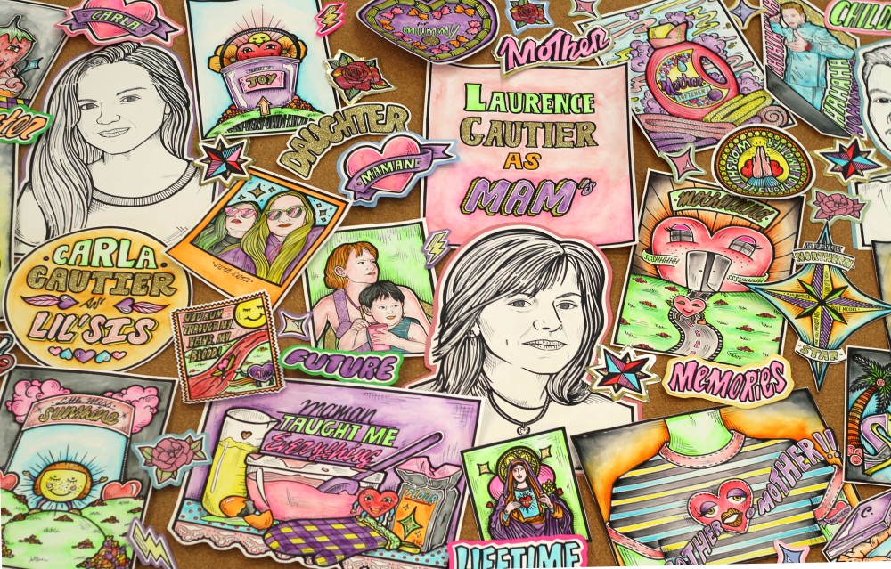
Noughts & Crosses // Final Product

FINAL BOOK COVER – PENGUIN COMPETITION


I had chosen this book out of the three options after seeing its previous covers and finding them very classic, boring and extremely unappealing. Therefore I wanted to take this challenge and create something more eye catching, more intriguing and more appealing to the audience. I believe I did manage to do this, but that’s a personal opinion. I feel at least that I accomplished to do what I had set off to do and I was satisfied with how my final work looked.  I didn’t win the competition but I really do feel that I had taken on the challenge successfully.


COVER2.3


salome.jpg


N & C // COMPOSING

WORK

Once I had two photos to work with and I had edited them to my liking, edited them properly so that they would convey this idea of upside down situation, I started composing all the separate elements together and creating a couple of options, changing the lettering on the title and author’s name and where/how they were placed.


COVER1 2.jpg


The covers were coming together well, I was starting to get an idea of which look I liked best, but with this photo I wasn’t quite satisfied yet. It wasn’t transmitting what I had in mind.


2ND PHOTO COMPOSITIONS


COVER2.1.jpg


This photo worked a lot better for my concept from the get go, and putting it all together with the rest of the elements only confirmed that.


NOUGHTS & CROSSES

1ST IDEAS & 1ST SKETCHES

I had a couple of first ideas based on some selected quotes from the book that had particularly interested me and showed different sides of the book, different sides I could use as a theme for the front cover.


RESEARCH & INSPIRATION


Once I had an idea I liked and wanted to work with, I needed to do a little research, find some inspiration. My idea was to show this situation of reverse racism that was taking place in the book. I wanted to convey this by showing famous moments in history where black people suffered injustice by the hand of white people and turn that around. Therefore I started looking into recent events such as Black Lives Matter but didn’t find anything that triggered my interest. I wanted something more historical. And what could fit better then photos of the first time a black student went to an all white school?


BLACK LIVES MATTER //


BLACK INTEGRATION IN ALL WHITE HIGH SCHOOLS


elizabeth-eckford.jpg


nervous-girl-first-day.jpg


THANKS STOUT

TURNING POINT


Although I had done all of this work and thought it looked good, I was losing interest. I was starting to question whether I really wanted to do this, realizing that although graphic novels are a big part of my visual identity and source of inspiration, they are not a hobby of mine, I don’t read them in my free time, it is not something I enjoy. So why was I making one? And at the same time that I was thinking all this I was also working on another project (tutor project) and creating work that I was very excited about, where I was really expressing myself and felt completely free of boundaries or obligations, I was just creating work for myself and that work looked like me, I owned it. This made me realise that what I was creating for this project, was not my work, I was trying too hard and it wasn’t flowing naturally. I needed to change directions. So I let go of everything and just illustrated what I wanted, my feelings about my mum (see the two illustrations on the left). And I felt free, like myself again. This is where I belonged and that’s what I wanted to do.


DISCOVERING WILLIAM STOUT


I have to mention William Stout as I believe he was part of what made me realize that what I was doing was not enough. Whilst I was working on my graphic novel and going back and forth to my research I discovered William Stout and fell completely in love and realized that actually, a couple years ago I had bought a book about Jazz and blues music because the illustrations were absolutely extraordinary (see portrait below). Right then Stout became one of my favorite illustrators and motivated me to do more and better, bigger, bolder, brighter!


This slideshow requires JavaScript.


https://www.williamstout.com/

MAN RAY & POETRY


Les Mains Libres


Paul Eluard & Man Ray

“Man Ray offered artists in all media an example of a creative intelligence that, in its ‘pursuit of pleasure and liberty’ unlocked every door it came to and walked freely where it would” (ARTnews, “The Century’s 25 Most Influential Artists”).

FIRST EDITION, one of only 675 numbered copies, illustrated throughout with full-page plates by Man Ray. 

“During the thirties, Man Ray made a large number of drawings while in Paris or travelling in the south of France. Man Ray had shown these drawings to Eluard, who had asked him to leave them with him. On Man Ray’s return, some weeks later, he found to his delight that his friend had ‘illustrated’ each drawing with a poem. This new and unexpected proof of Eluard’s esteem resulted in the publication of Les Mains Libres, a book in which more than sixty pen-and-ink drawings are reproduced, fifty-four of them opposite Eluard’s poem” (Penrose, 134).


Man Ray rear cover 1000.jpg

BROKEN FINGAZ & MIKE GIANT


BROKEN FINGAZ


Broken Fingaz  are a world-renowned psych-pop collective from Haifa, Israel. Since their founding in 2001, its members Unga, Tant and Deso have worked prolifically on the international art scene, with a practice that includes to animation, installation, painting, murals, graffiti and graphic design.

Using bold lines and acid pop colours, Broken Fingaz Crew’s work visually alludes to ‘80s comic book illustrations and pulp horror. Exploring two of art history’s oldest themes – sex and death – the BFC’s humorous, controversial and often sexually explicit imagery contemplates notions of the abject through a confrontation with the baseness of humanity and its suppressed desires. Bodily dismemberment, mutilated limbs and skeletons represent not only death, but the need to understand the physical body and the unseen side of our corporeality.


http://galleriavarsi.it/artists/broken-fingaz/


https://brokenfingaz.com
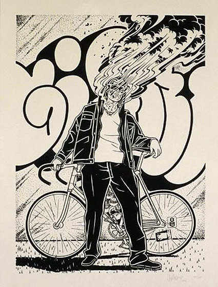


MIKE GIANT


A genuine idol of the United States subcultures and their arts, Mike Giant is a celebrated American graffiti artist, illustrator and tattooist. Driven for the entirety of his career by BMX bicycles, tattoos, skateboards, street art and all around rebellious spirit, this artist created an impressive reputation of a true legend that serves as a source of inspiration to all aspiring artists desiring to go down a similarly creative and alternative path of art. Renowned for his versatility, Mike Giant is the go-to man if you are interested in learning a bit more about any of the following art forms: media covering, graffiti, design, photography and tattooing.

https://www.widewalls.ch/artist/mike-giant/

http://www.mikegiant.com/


11111.jpg


mike-giant.jpg

TATTOO SHEETS

TATTOO SHEETS


Tattoos have been my main source of inspiration for my illustrations since day one. I could relate the most to this style: its’ boldness, precision, impact, colours, content… For every project this is my first source of inspiration, my first go-to research. It gets me motivated and confident to make work of my own.

In this case I was looking at what is called “tattoo sheets”. They are pages filled with random illustrations usually revolving the same theme. I was looking at these because I wanted to create something similar about my mum as a starting point. I wanted to create random elements, illustrations, that I could play around with and push further, create something out of.


https://www.pinterest.es/elliotfloyd/-illustration-%2B-to-illustrate/

https://www.pinterest.es/elliotfloyd/ink/


CHICO Y RITA

A BRILLIANT MOVIE & WORK OF ART


Chico and Rita is a 2010 American-Spanish adult animated music romantic film with Spanish and English languages directed by Tono Errando, Fernando Trueba and Javier Mariscal. The film was produced by Fernando Trueba Producciones, Estudio Mariscal, and Magic Light Pictures. It received financing from CinemaNX and Isle of Man Film. It won the Goya Award for Best Animated Film at the 25th Goya Awards and was nominated for the Oscar for Best Animated Feature at the 84th Academy Awards (the first nomination for a Spanish full-length animated film).


1013e9ebe8ebb2470f9d256beef81f47.jpg


The story of Chico and Rita is set against backdrops of Havana, New York City, Las Vegas, Los Angeles and Paris in the late 1940s and early 1950s. Chico is a young piano player with big dreams. Rita is a beautiful singer with an extraordinary voice. Music and romantic desire unites them, but their journey – in the tradition of the Latin ballad, the bolero – brings heartache and torment.


chicoandrita_perform_hotelnacional.jpg