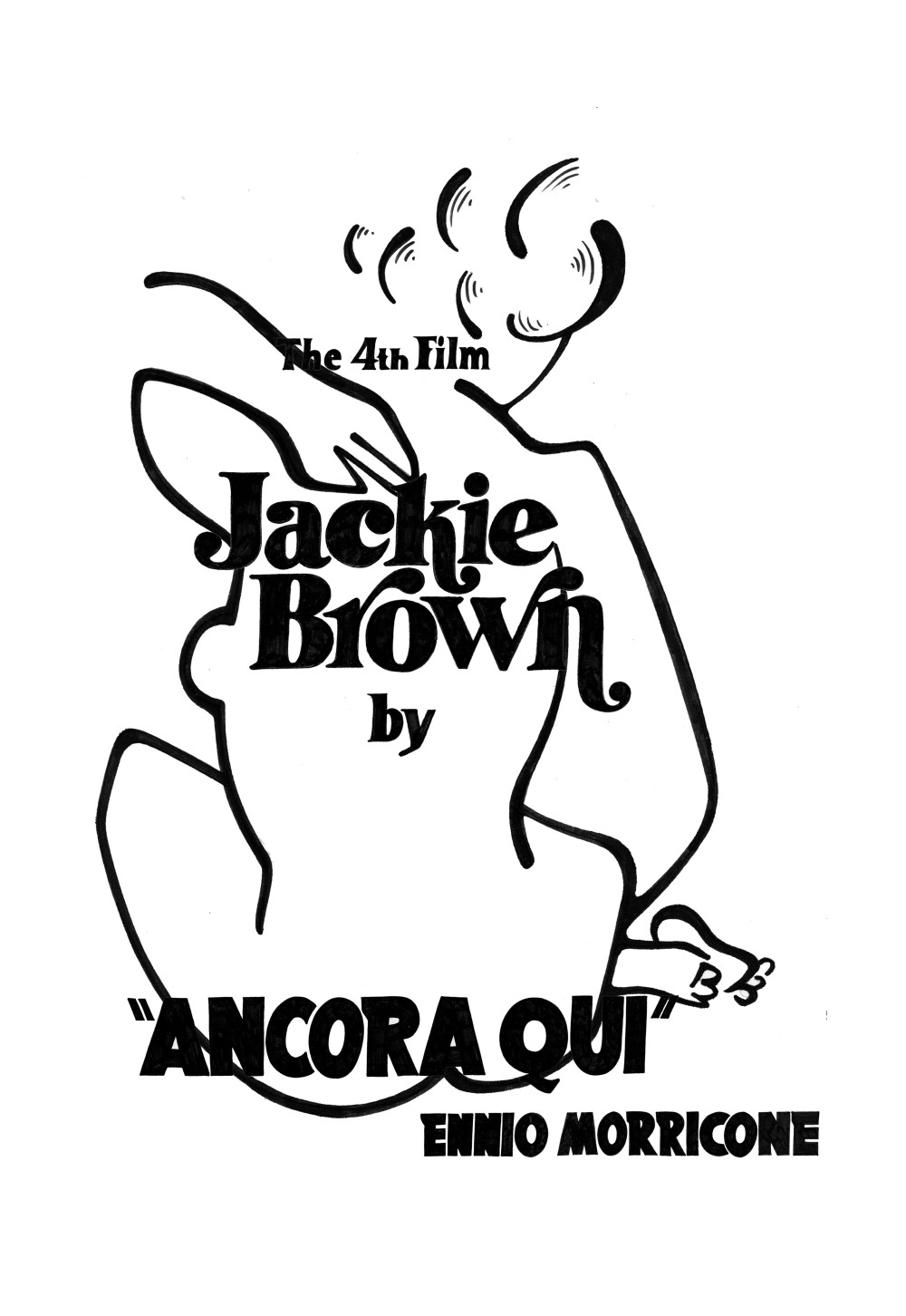
.MATISSE X 2.
After making first designs and not finding them quite right it was time to give it another go. And this time I felt it was right to mix inspirations together; Matisse and typography in movies. I felt suddenly much more inspired to make something not as typical and museum looking t-shirt.
*MOVIE TYPOGRAPHY*
I picked names, titles and other words found in Quentin Tarantino movies and started doing them by hand. Once I had hand lettered them all I then scanned in through photoshop to clean them up and be put together in a composition.
_WORKING_
Putting it all together… This is my favourite part. Not the lettering on its own. Not the illustration on its own, but together. Even without colour I was finding this image a lot more thrilling than the first designs. The lettering was bringing the illustrations to life.

*COLOUR 1/COLOUR 2*
Adding colour. I wanted to stay true, at least a little, to Matisse’s vibrant use of colour. It seemed to me that this design almost looked like a book cover or the cover of an old jazz vinyl. I felt quite satisfied with the results.
2ND REDESIGN
Another redesign. Another way of mixing up Matisse and lettering.


