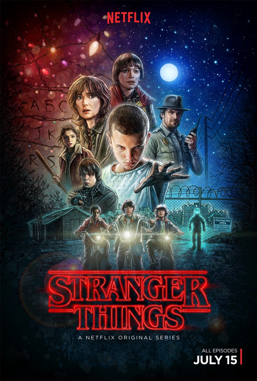
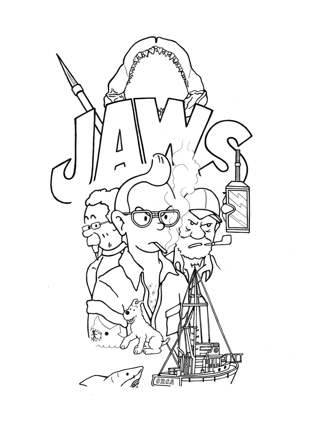
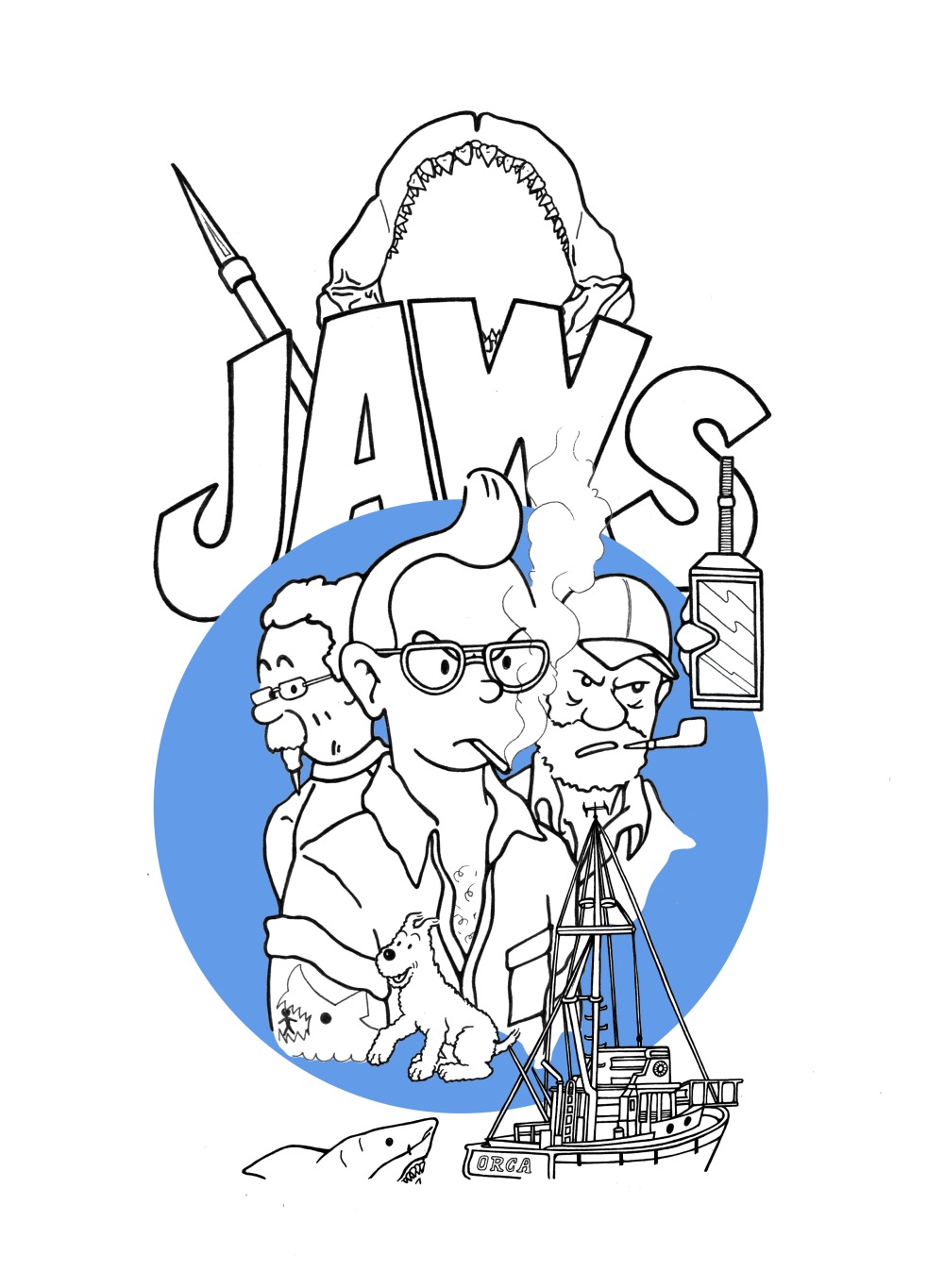
MAKE THE REMAKE

MORE ARTIST RESEARCH FOR POSTER PROJECT.

Since I was remaking classic movie posters with my own spin it was key for me to look at the many remakes that already exist made by plenty of graphic designers and illustrators out there that put their own spin on it. And the best place to find these was Pinterest.

Take a look :


FAVOURITE


MEDIOCRE


NOT SO GREAT


https://www.digitalartsonline.co.uk/features/illustration/how-illustrated-movie-posters-are-making-come-back/

https://www.vice.com/en_uk/article/bnaaew/can-we-have-movie-posters-like-this-again-please-

NEW STYLE NEW TYPE

1.

BEGINNINGS

LCOMPO.jpg

2.

ADDING LAYERS

thumbnail_LETTERING2.jpg

3.

FINISHED


LETTERING POSI.jpg


This design was done and I was ready to print. I was satisfied with the result and thought it looked like a strong visual piece and I was happy it made only of hand lettering. I should work more with just that.

POST POSTERS

BEGINNINGS


Illustrating the elements


tintin parts.jpg


COMPOSING

Putting the elements together. The poster begins to take form.


JAWS = TINTIN

TINTIN2.jpgTINTIN1.jpg


STAR WARS EPISODE I = SCOOBY DOO

SCOOBYDOO1.jpg


CASABLANCA: TOM & JERRY


TOM+JERRY ELEMENTS.jpg


TOM+JERRY1.jpg

//CLASSIC//

FAMOUS CLASSIC MOVIES


Just taking a look at some of my favourite classic movies and their posters, deciding which movies I would work with and deciding which elements of the posters I would keep and work with.


images-1.jpeg


I had decided to remake the posters of Casablanca, Star Wars Episode I and Jaws.

POSTERS INSPIRATION

KYLE LAMBERT

”Stranger Things”

Kyle Lambert is an L.A. based visual artist, who is known for creating commercially successful artwork and illustrations for creative advertising in the entertainment industry.

Kyle originally trained as a traditional oil painter and now leads the field as a breakthrough digital artist. His approach to art involves detailed research, experimentation, and the development of new tools and techniques to create visually impactful artwork.

Over the past 10 years Kyle has worked with some of the world’s largest brands, including Apple, Adobe, Disney, GQ, Netflix, Paramount Studios and Vanity Fair.

For more biography; http://www.kylelambert.com/about/

I think this artist is amazing and he really blows my mind, mostly when it comes to his movie posters art which really embodies movie poster art of the 80s and 90s. The posters I look up to. I love his work just because he is helping illustrated posters to become popular again.
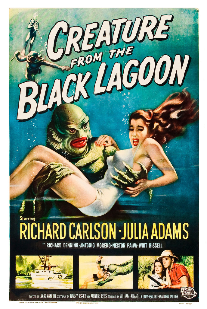
 

6f1c7f40664543.5787e03bf042c.jpg

stranger-things-story+fb_647_020617035747.jpg


REYNOLD BROWN

”Black Lagoon”

Reynold Brown (October 18, 1917 – August 24, 1991) was a prolific American realist artist who painted many Hollywood film posters.

6004427016_a0351d0934_b.jpg


For more biography; https://horrorpedia.com/2015/09/08/reynold-brown-artist/

http://www.americanartarchives.com/brown,reynold.htm


6003890707_9ff25760f7_b.jpg


I am a huge fan of Brown’s work. I have always loved the look of old horror comics such as Fantastic Novels and Brown really is the artist for this kind of work. The colours and lettering in his work are just excellent and such strong visual pieces of work. Major source of inspiration for me and it always will. Definitely work I look up to.
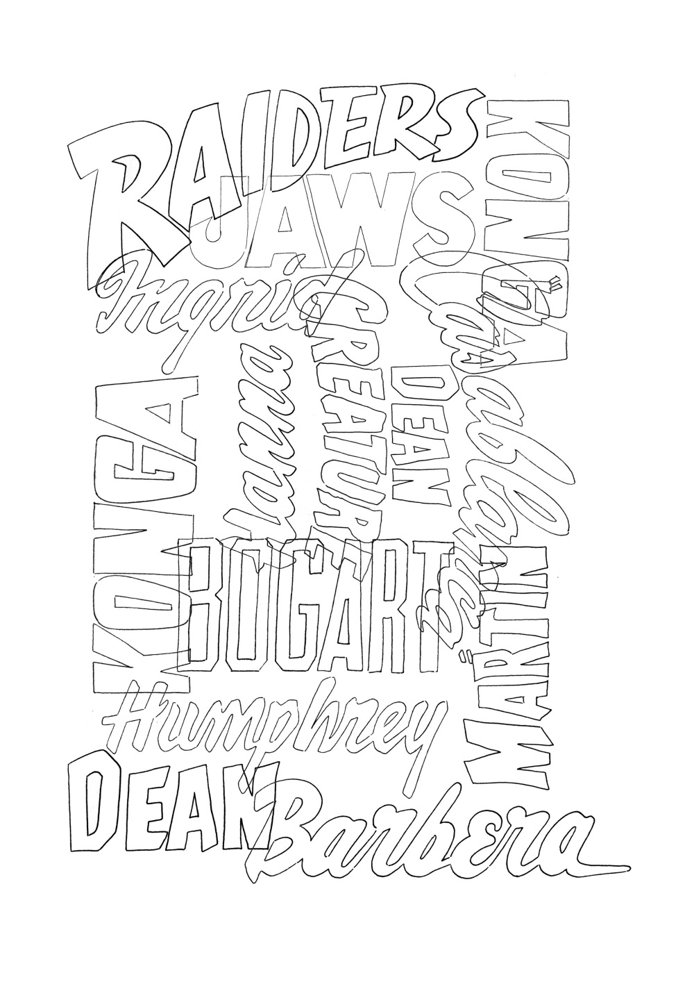
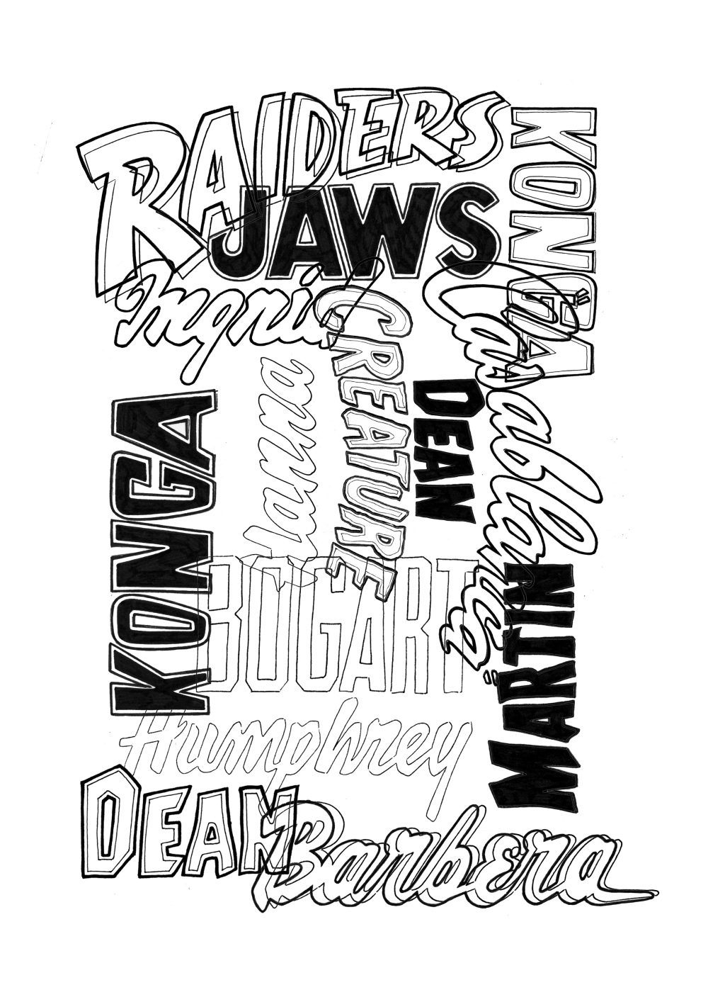
 

ROBERT CRUMB

For the typography


Robert Dennis Crumb (/krʌm/; born August 30, 1943) is an American cartoonist and musician who often signs his work R. Crumb. His work displays a nostalgia for American folk culture of the late 19th and early 20th centuries, and satire of contemporary American culture.

For more biography and more work; https://www.crumbproducts.com

https://en.m.wikipedia.org/wiki/Robert_Crumb


lf.jpg


All I can say is: genius. Genius style and genius lettering. I would like to think and hope that one day my work could reach his standards.


DREW STRUZAN


Drew Struzan (born March 18, 1947) is an American artist known for his more than 150 movie posters, which include all the films in the Indiana JonesBack to the Future, and Star Wars film series. He has also painted album covers, collectibles, and book covers.

For more biography and work: http://www.drewstruzan.com

https://www.wired.com/2015/02/drew-struzan-movie-posters/


Lundi.png


Genius and absolute legend of the world of movie poster art. He has created legendary posters that will always remain so and will always be found on the walls of my bedroom.
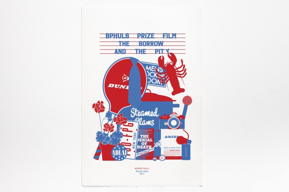


*WESTERN LOVE*


It is very hard to fin the artists behind the posters of Westerns but still I keep them safe in my little catalogue of favourites. Westerns is one of the other things I share with my big brother. I remember sitting on the sofa with him and watching John Wayne in awe, over and over again eventhough I was around 7 and those movies were made in the 1960s. They were a great part of our childhood.


PROJECT N2// POSTERS

nostalgia//childhood//love

SCOOBY-DOO // TOM & JERRY // TINTIN

It was time to start on my second project:

REMAKE OF CLASSIC MOVIE POSTERS WITH CLASSIC CARTOON CHARACTERS.

Hannah Barbera


Some visual research needed to be done before starting anything. So the first stop was looking at the geniuses who created so many great cartoons for mine and past generations; Hannah Barbera.

 Hanna-Barbera Productions was formed in 1957 by William Hanna and Joseph Barbera—two animators from MGM Studios. They left MGM when the studio stopped production on animated films. Hanna and Barbera achieved immediate success on television with The Huckleberry Hound Show in 1958, followed later by the highly popular prime-time series, The Flintstones. Through the next 30 years, Hanna-Barbera produced an astonishing 249 individual cartoon series for television – totaling over 1,200 hours of original episodes.


For more biography; https://www.illustrationhistory.org/artists/hanna-barbera

Hannah-Barbera were the creators of the two awesome and classic cartoons Tom & Jerry and Scooby-Doo.


Hanna-Barbera_1988_2.jpg


Hanna_Barbera_logo.png


Tom & Jerry


tom-and-jerry-hd.jpg


Scooby-Doo

WHERE ARE YOU?


I remember coming home from school every day at 4pm with my brother, my mum making us a snack, and us enjoying it whilst watching Scooby-Doo and loving it just before it was time to move on to homework. It was the best of times and every day I looked forward to that moment that I shared with my big brother.


WAY_title_card.png


Hergé

Tintin


Georges Prosper Remi (22 May 1907 – 3 March 1983), better known by the pen name Hergé, was a Belgian comics writer and artist. “Hergé” is the French pronunciation of “RG,” or his initials reversed. His best known  and most substantial work is The Adventures of Tintin comic book series, which he wrote and illustrated from 1929 until his death in 1983, leaving the twenty-fourth Tintin adventure Tintin and Alph-Art unfinished. His work remains a strong influence on comics, particularly in Europe. He was inducted into the Comic Book Hall of Fame in 2003.


For more biography; http://tintin.wikia.com/wiki/Hergé


Growing up with a big brother meant that I grew up with classic cartoons and comic books. And my brother had ALL of the Tintin comic books. And I love them just as much as he did. And now that I am older, and an illustrator. I can appreciate them even more. The shape and form of the lines, the colours, the way the shades are done.


tintin-1024x768.jpg

23-tintin-covers.jpg

RICHARD HOGG

//CHECK IT OUT//

PROJECT N1//ARTIST RESEARCH N2

RICHARD HOGG

Richard Hogg is an artist and illustrator.

His work encompasses illustration, film making, murals and videogames.

He made the award winning Playstation game Hohokum and recent illustration clients include Vodafone, Three, The Guardian, the Design Museum, O2 and the Surrey Bird Club.

When not illustrating Richard enjoys piña coladas, getting caught in the rain and making love at midnight in the dunes of the cape.


*transparency*

THOUGHT:

Try out the use of transparency

My favourite part and most effective part in my opinion is the right side of this image, with the bottles where the transparency is most simple but really most effective.

Richard-Hogg-Fruit-Still-Life.png


*colour*


424f197ee9921a7f4ebdecd14d588a54--pop-art-funny-stuff.jpg


*more typography*

THOUGHT:

Make GIFs using typography, hand lettering etc…


Making GIFs is something I discovered in first year and have enjoyed since then. But I haven’t worked with this tool this year and I think it is definitely something I should come back to in a similar form to the one below, with lettering. Just looking at this brings many exciting ideas and possibilities.


wellInever570.gif


*white spaces*

THOUGHT:

Use only one colour.


Most of my work is almost done in black only or black sith other colours. These images below prove that working with a single colour, that is not black, can be very effective and it is something I will work with in my future projects.


Richard-Hogg-Beer-Mats


SlotsOfFun570.jpg

CRISPIN FINN

//CHECK IT OUT//

PROJECT N1 – ARTIST RESEARCH 1

CRISPIN FINN

About

Crispin Finn is the pseudonym for duo Anna Fidalgo and Roger Kelly.

Based in London and Margate, we create illustration, design,
screen prints, stationery, ephemera and assorted wares.


*typography*

The work of Crispin Finn includes some really great lettering. Some that I will definitely use for inspiration in future work.


cache_680_680_4__100_CF_MODERN_CARD.jpg


*other*

Although the combination and contrast of using red and blue as the two main colors is effective, I feel it has become and trend and it seems like many graphic designers and illustrators have grabbed this aesthetics and used it repeatedly and because of this it is no longer surprising or exciting. But just a little bit deja vu. Still, it is an aesthetic that I do appreciate and may use at some point in one of the two projects.


*movie posters*


I do really like the way Crispin Finn has come up with posters for famous movies. It reminds me of work I used to do when I was a little younger: I would think of a theme and illustrate elements that would represent this theme or related to it without being too direct or obvious. Such as these posters. So although this is not what I had in mind for my two projects and not the path I wanted to take, this is definitely something I can appreciate and will come back to in the future.


AMERICAN PSYCHO_

cache_680_680_4__100_AMERICANPSYCHO-1.jpg


ROME SWEET ROME_

cache_680_680_4__100_Rome 1.png


JAWS_

cache_680_680_4__100_JAWS-1.jpg


BREAKFAST AT TIFFANY’S_

cache_680_680_4__100_BAT.jpg


ANNIE HALL_

cache_680_680_4__100_AH-1.jpg


THE BIG LEBOWSKI_

cache_680_680_4__100_LEBOWSKI-2.jpg


I had previously looked at Crispin Finn for artist research in previous projects and seem to come back to it quite often. They have strong visual pieces that I seem to be drawn to and should and will keep coming back to and use a lot more as source of inspiration and ideas. Crispin Finn is a good artist to keep in your catalogue of inspirations.

//REDESIGNING//

.MATISSE X 2.

After making first designs and not finding them quite right it was time to give it another go. And this time I felt it was right to mix inspirations together; Matisse and typography in movies. I felt suddenly much more inspired to make something not as typical and museum looking t-shirt.

*MOVIE TYPOGRAPHY*


I picked names, titles and other words found in Quentin Tarantino movies and started doing them by hand. Once I had hand lettered them all I then scanned in through photoshop to clean them up and be put together in a composition.


_WORKING_

Putting it all together… This is my favourite part. Not the lettering on its own. Not the illustration on its own, but together. Even without colour I was finding this image a lot more thrilling than the first designs. The lettering was bringing the illustrations to life.


Jackiebrown.jpg


*COLOUR 1/COLOUR 2*

Adding colour. I wanted to stay  true, at least a little, to Matisse’s vibrant use of colour. It seemed to me that this design almost looked like a book cover or the cover of an old jazz vinyl. I felt quite satisfied with the results.


2ND REDESIGN

Another redesign. Another way of mixing up Matisse and lettering.