EMBLEM STUDIOS

//EMBLEM STUDIO LOGO DESIGNS//


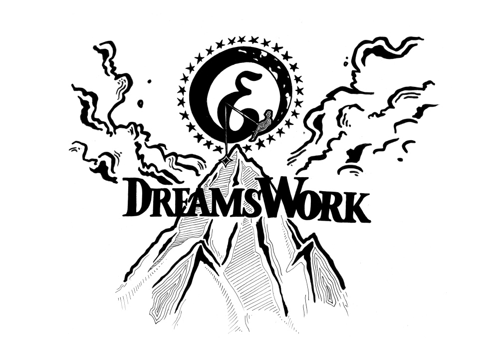
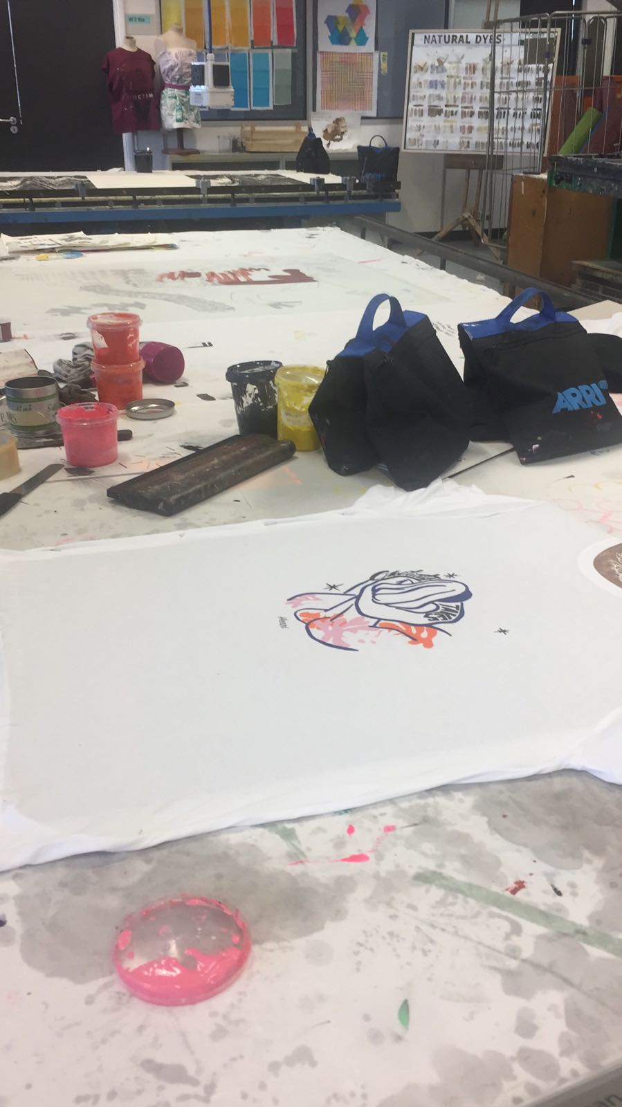
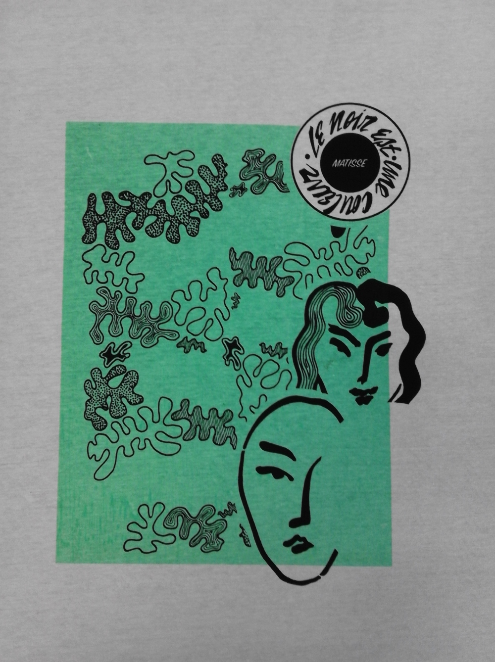
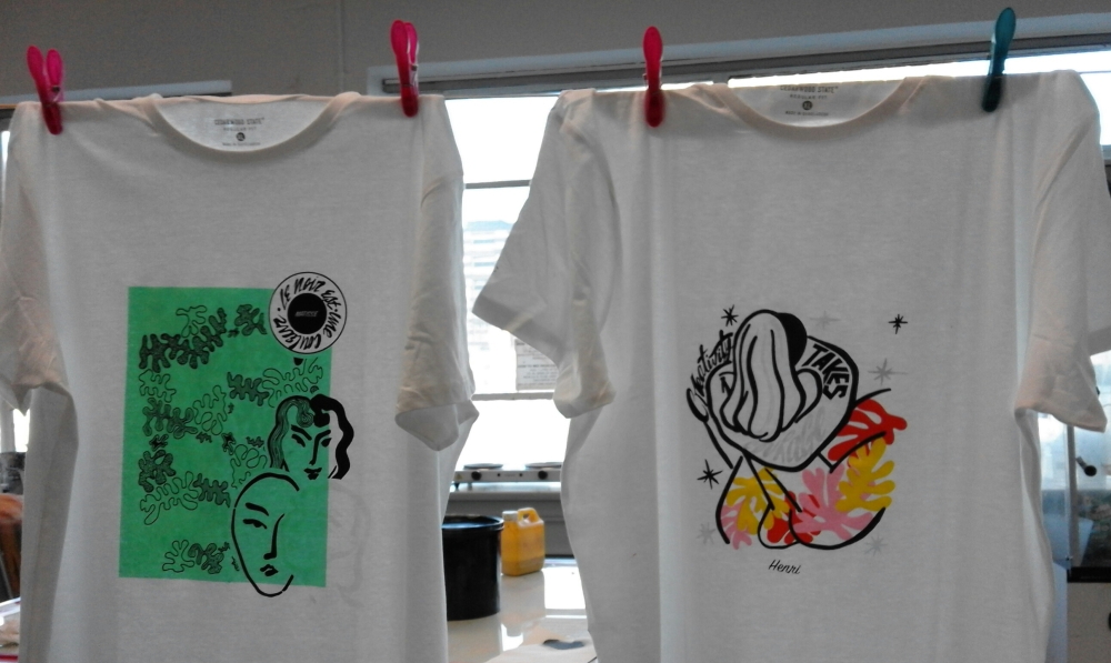
After designing the Matisse t-shirts and printing them out I moved on to making designs inspired by famous film studio logos: Paramount, Columbia, MGM & DreamWorks. I wanted to do this in this project because I love movies, they are a big part of what inspires me in my practice and every time a movie starts and I see the logo of the studios, I get excited. They are full of history and represent thousands of amazing movies.

My idea was to combine key elements of these logos into one. This is what I came up with:

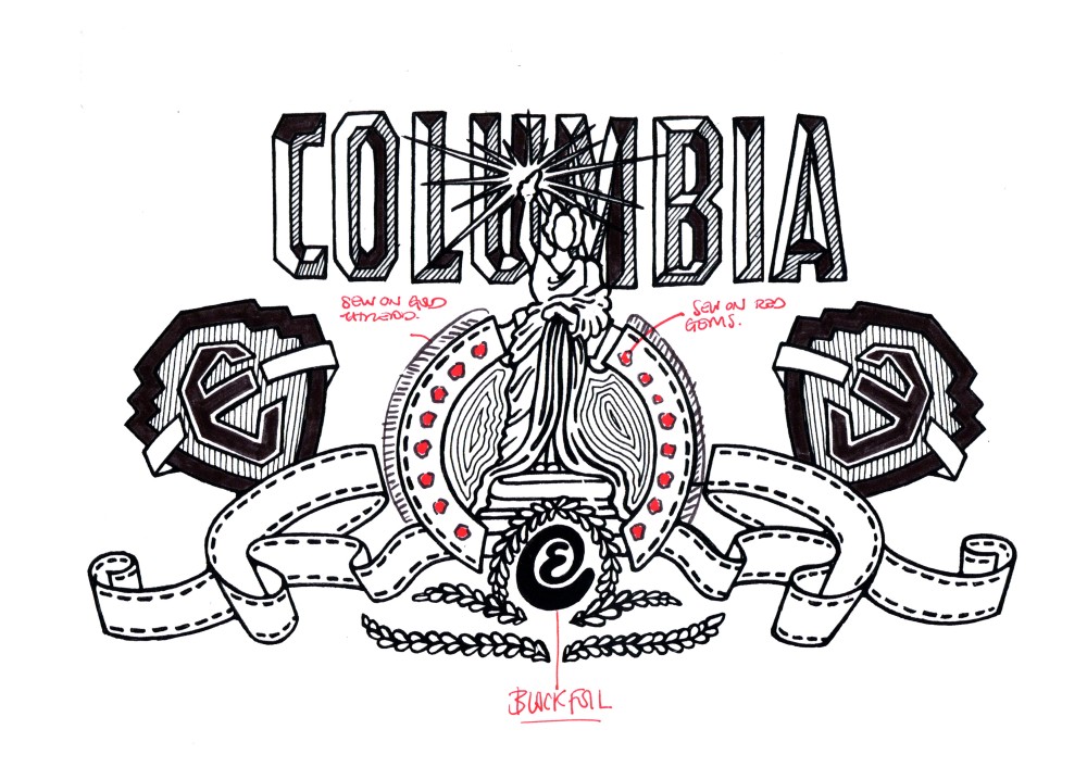
First, Columbia & MGM:

columbia

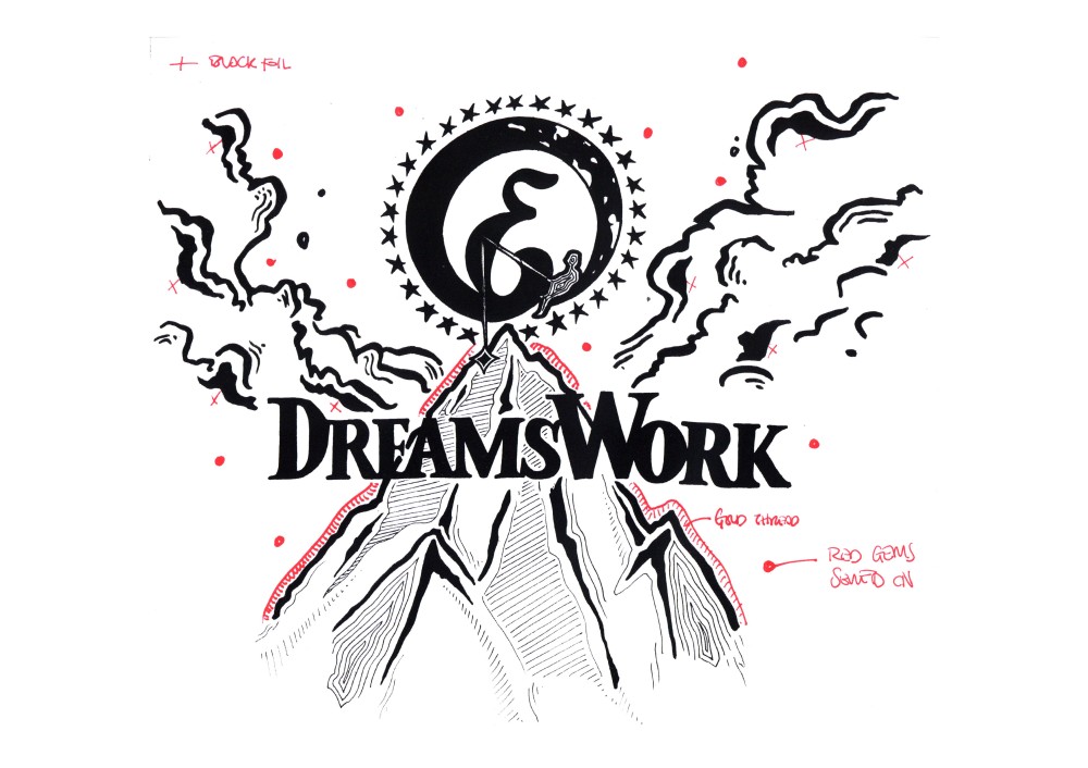
Second, Dreamworks & Paramount:


dreamswork


*EDITING*

Once the designs and compositions were finished came a little bit of editing and adding details. Also planning how they would be printed out.


DREAMSWORFIXcolumbiafix


//COLOUR//


At this point I was fully envisioning them, what colour and size t-shirt, etc…


dreamsworkbeige1.jpg


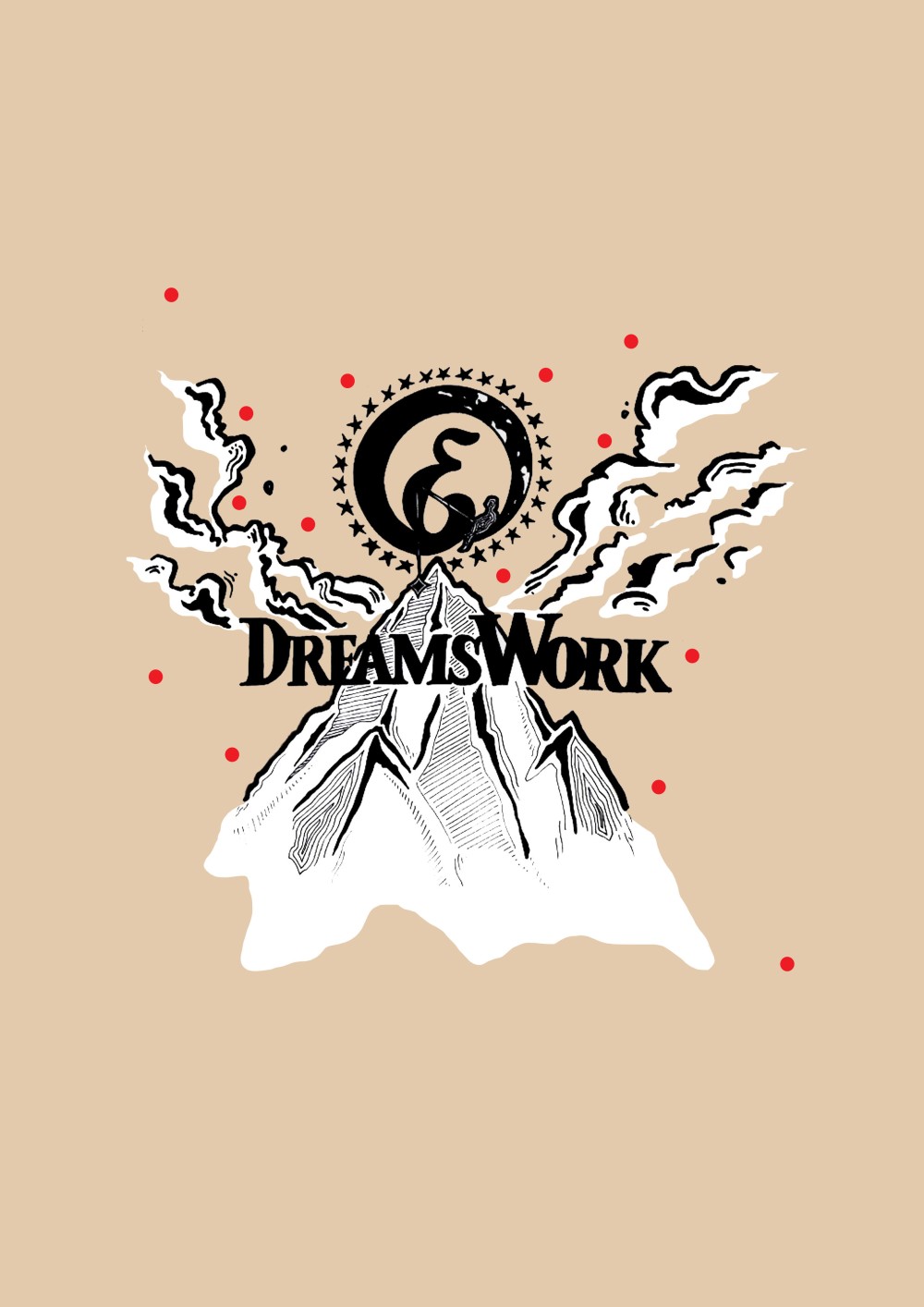
But, after all, I decided not to print them as I was not stimulated by these images that I had created. I was not excited to go further with them and I thought they looked a bit too much like an art student trying to make a cool hipster looking t-shirt. And that’s not what I wanted. I wanted visually impacting. This was not it.

UNE ODE À HENRI MATISSE

MATISSE


As I have mentioned in previous posts dedicated to this project, this project in particular will be inspired by the work of Henri Matisse, hand lettering and logos of famous film studios such as Columbia, Dream Works and Paramount. At the beginning I started working on these compositions with all these inspirations separately. I was planning to make two Matisse t-shirts and two Studio t-shirts, separately. These are the first illustrations and compositions I came up with:

1st Designs


When I had finished them I was really quite happy with them and found them aesthetically quite impacting. But, after a chat with my tutor who mentioned that the designs looked like a t-shirt made for Henri Matisse, like a souvenir for a museum, I saw it immediately and no longer liked my work. It was too commercial, not unique enough and very different from my usual work which is not always a bad thing but in this case, it was. Anyhow, I decided I would print them anyway as practice, research and experimentation. Also because I had planned to do a lot of foiling and flocking on these t-shirts and needed to practice and see the result. The was important because I had never involved flocking and foiling in my previous designs and collections because I have never liked it on t-shirts. My opinion is that it looks a bit cheap and old fashioned.


1st TSHIRT

/IN THE PROCESS OF PRINTING/


IMG-20171027-WA0010


/COLOUR AFTER COLOUR/


2ND TSHIRT


20171027_150212


20171027_163835-1


ADD PHOTOS WITH FAILED EXPERIMENT OF FOIL AND VELVET


The printing came out perfect, bold and crisp. But the flocking and foiling was another story. It was not successful at all, and I did not like the way it looked at all, it made the t-shirts look even more old fashioned and common. Every time I have tried flocking and foiling on textile it has never worked very well and overtime it was with black foiling. It was my thought that if I were to use flocking and foiling in the future it would be in much smaller quantities in a much smaller part of the design, in a discreet way. A wink, not a shout.

LNDN ZOO

31st October 2017

TRIP TO THE ZOO


. A LITTLE TRIP TO THE ZOO .

(Like when you were in School and for Art class you would go on a trip to.. the zoo/aquarium)


Well this really felt very similar to those art trips we would take with school. And honestly, whilst I was walking around the zoo and seeing kids on school trips, I didn’t feel much different from them. I don’t see how this kind of trip his relevant for BA degree university students, even less in third year. If this kind of trip was ever relevant it would have been in first year to practice our drawing skills and live drawing skills. But that time is over when you are in 3rd year. Easy to say that I and most people did not enjoy this “trip” and found it completely unnecessary.


It was a cold grey day and most animals seemed to feel it and hide in the warmth of a dark corner. This made the visit quite grim and grey. The older I get the sadder I find Zoo’s anyway, to see wild animals just look so lifeless with thousands of people just starring at them in awe. I wonder what goes on in those poor animals’ heads.


The most interesting part of the Zoo was the aquarium because it felt like a totally different environment. It felt like stepping into a dark peaceful bubble where everything was quiet. This part I enjoyed but not as something relevant to my practice, just as something personal as I love sea life and scuba diving.


These are the illustrations I came up with quickly whilst at the zoo, including some hand lettering.  The “posters” below are a very quick example of how I could manipulate these illustrations and turn them into something else.


The most exciting part for me was entering the Reptile zone and seeing the Boa’s cage where Harry Potter speaks to the snake in the first movie of the sequel.

PROJECT 1//PROJECT 2

TITLES//5 KEY TEXTS//5 KEY PRACTITIONERS


PROJECT 1: A series of 4 tshirts inspired by Matisse and movie credits & studio logos, 2 tshirts for each.

(2 Tshirts each, to develop & better my printing skills and produce “finished” products; Add texture, experiment with printing: sewing, beading, velvet/flocking, foil, double sided printing.)

PROJECT 2: 3 posters inspired by old movie posters, like a remake of classic movie posters but using cartoon characters from 3 of my favourite cartoons; Tom & Jerry, Scooby-Doo & Tintin.

(Develop & better typography/lettering skills – & recreate an aesthetic I love so much. Both handmade and use of illustrator)

– WORK THAT REFLECTS WHAT INSPIRES ME VISUALLY; WORK BASED ON THAT — BUT 2 DIFFERENT PROJECTS. EXPRESSED IN 2 DIFFERENT WAYS THAT I LIKE TO EXPRESS MYSELF VISUALLY: PRINT ON CLOTHING//TEXTILE & POSTED.


Project 1


Title:

Une ode à Henri Matisse

5 Practitioners:

– Henri Matisse – Goodhood  -Hutch LA –

5 Key Texts:

– When fashion & art collide


Project 2


Title:

Better Old than New// Take that and rewind it back// Be kind Rewind

5 practitioners:

– Kyle Lambert (Stranger Things) – Reynold Brown (Creature from the Black Lagoon) – Robert Crumb – Hergé (Tintin) – William Hannah & Joseph Barbera ( Hannah Barbera: Scooby-Doo & Tom and Jerry).  MORE: Reynold Brown, Drew Struzan.

5 Key texts:

– How Illustrated Movie posters are making a comeback

– The top 25 movie posters of all time


//MATISSE @ROYAL ACADEMY//

//HENRI.M//


ROYAL ACADEMY OF ARTS

Exhibition;

Henri Matisse


Royal Academy’s exhibition of Henri Matisse is called “Matisse in the Studio” and it focusses on all the daily objects Matisse collected from all over the world. Objects that he treasued and that played a very important role in his creative process and you can see these objects wonderfully depicted in his work. Royal Academy of Arts described the exhibition:


“Step into the studio of Henri Matisse, brimming with the artist’s treasured objects. Focusing for the first time on the important role they played in his creative process … Matisse drew his collection from the far corners of the world.. Rarely of material value, these objects were nonetheless precious. Offering points of departure to which he could return again and again, they appear in his work across spans of decades, reivented afresh in each new setting… Matisse’s object formed his repertoire, but they also provided him with influences from beyond the limits of western art… This captivating exhibition offers an intimate insight into one of the 20th century’s greatest creative minds, seen through treasured personal objects and the paintings, sculptures and drawings they inspired.”

I have always loved Henri Matisse since a very young ags, since I was introduced to him in art class at school. I though his line, use of colour, his cut outs… were magnificent and so effortless and wonderful to look at. I thought he was truly amazing, unique and different from anyone else. And I still do. This exhibition, although small, was a treat for me. It was a wonderful collection of his work, that showed how much his work varied in line and texture, stroke, technique… It was amazing to see all that in one small room. I felt I got insight into Matisse’s work and him as an artist that I never had before. It was wonderful to see his work first hand. You could see how all of his work had strength, individually; his portraits, drawings, cut outs, patterns… It was not work that looked impressive once shown as a group all together in one room. Each piece of work had incredible value and showed something different about Matisse.